Example of Pagination - default
<BcPagination
  totalCount={112}
  currentPage={1}
  controls='id'
  onPageChange={() => {}}
/>
React documentation
Last modified:
BcPagination React component is only built for an SPA-like implementation and makes use of native <button> and <select> elements. This version of pagination does not trigger a page navigation. Hence, it will be very much suitable for paginating tables’, lists and react-router implementation.
The component also applies ARIA attributes which makes the pagination accessible and link to the UI element it is controlling.
BcPagination will not render anything there is only 1 page to display.
BcPagination Props
| Prop | Type | Required? | Default | Description |
|---|---|---|---|---|
| className | string | false | Custom className to pass alongside bc-pagination--menubar | |
| controls | string | true | Space separated list of one or more ID values referencing the elements being controlled by the current element | |
| currentPage | number | true | 1 | Use this props if you want to fully control the pagination component. For example, when you have a page params in your url, you could pass that to the pagination component to display the correct page number. |
| limitOptions | number[] | false | [25, 50, 100, 200] | An array of options to provide in the pagination limit selector. This gives you flexibility if you wanted to show different number of items per page |
| limit | number | false | 25 | The number of items to display per page |
| totalCount | number | true | 0 | The total count of a query result |
| onLimitChange | (limit: number) => void | false | Handler for when the limit selector changes value | |
| onPageChange | (page: number) => void | true | Handler for when the page is changed either via the page selector or the navigation arrows | |
| isDisabled | boolean | false | false | This prop is used to disable BcPagination controls. We want to restrict the user from accessing BcPagination controls when ‘isDisabled’ is set to true. |
Any extended types: N/A
HTML
Last modified:
Design
Last modified:
After much research into the best practices around pagination. Our design team came to the conclusion that we need to simplify our pagination component.
The old pagination implementation of pagination at Bugcrowd looks as follows
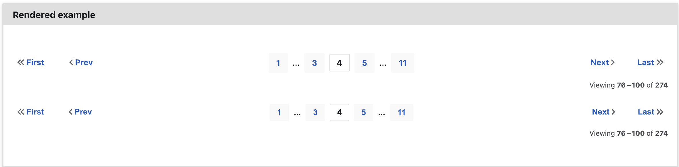
There are a couple of issues with the old implementation.
- There is a lot of logic required for the truncation logic
- The first and last page numbers are always there but users can go to these pages using the first and last arrow buttons
- For a user to jump to a specific page, it is a bit harder.
- As an accessibility user, to tab to the next page button, they need to go over all the rendered number.
With these in mind, our design team came up with the following UX.
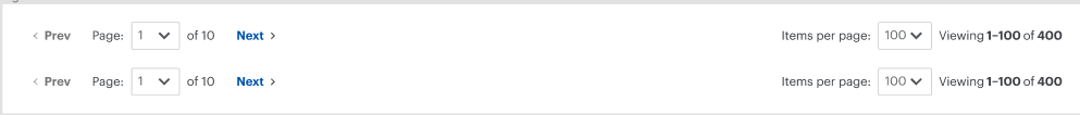
The new design is more utilitarian and enables users to jump to specific pages faster.
The new pagination component is less cluttered, with less logic around the truncation and the added feature of selecting how many results to load per page.
Accessibility
Last modified:
While <ol> would be suitable here given the linearity implied, use un-ordered lists (<ul>).
Non-visual assistive technologies (eg screen readers) commonly preface <ol> list items with their lexical position. This results in first announcing the lexical count of the list item, which will not align with the page count due to the [ellipsis] range indicators, and the First/Last/Prev/Next, controls.
Set aria-current="true" for the current numbered page anchor — this should also apply to the “First” and “Last” anchors when on those pages.
Set aria-hidden="true" on the list items that contain the range indicators, as these are entirely superfluous — and may cause confusion — to non-visual users. This does not visually hide the element.
Omit the jump control links — first/prev and next/last — when on the first and last page of listings respectively.
Provide a maximum of three pages prior to and after the current page; do not list every possible page.
Using pagination in an SPA
Use <button>s when paginating in a single page application.
Use ARIA to provide context for the navigation controls:
menubarrole on the wrapping container, replacing or overriding the implicit<nav>rolemenurole on the top-level wrapping<ul>menuitemroles for the first/last and prev/next buttonsmenuradioitemrole for each numbered page button
Accessibility with the React BcPagination
With the <button> implementation, the decision has been made to provide ARIA attributes to some of the individual elements to help assistive technology communicate changes in the pagination elements.
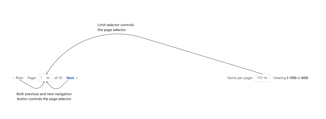
The page navigation section of the BcPagination react component has a live region which updates when the current page changes. There is also a screen reader only span which enables screen readers to read Page 1 of 5 pages.
The page meta section of the BcPagination react component also has a live region which updates when the current page or the limit per page is updated. That section also has an sr-only span so screen readers can read Viewing items 1 to 25 of 100.
Accessibility with pagination causing page navigation
aria-checkedfor the current numbered page button — this should also apply to the “First” and “Last” buttons when on those pagesaria-setsizefor each numbered page button giving the total numberaria-posinsetfor each numbered page button giving its lexical position within the set.
Rationale
Last modified:
The pagination pattern has two functions:
- As an interactive navigation
- As an indicator of where the user is within the paginated list index, providing via
<output>:- the current range of items presented on the page;
- from the total number of items in the paginated index.
See also
Last modified: