Our commitments
Last modified:
We have two core accessibility commitments:
- Inclusive design for our current and future users by taking an empathetic approach to a user’s scenario.
- Complying with the Americans with Disabilities Act by meeting WCAG 2.1 level
AA.
ℹ️ We believe the Design system as of writing meets level WCAG2.1 AA compliance.
Understanding accessibility
Last modified:
Everyone has abilities, and limits to those abilities; we are all only temporarily not disabled.
Practice inclusive design with accessibility provisions for permanent, temporary, and situational needs.
For example, take sight:
- A user could be blind (permanent);
- They could have forgotten their reading glasses (temporary); or
- They might be outside in the sun causing glare off the screen (situational).
Dos and don’ts
Last modified:
General guidance & awareness of accessibility for inclusive design.
Please make use of the UK’s Government Digital Service (GDS) accessibility posters:
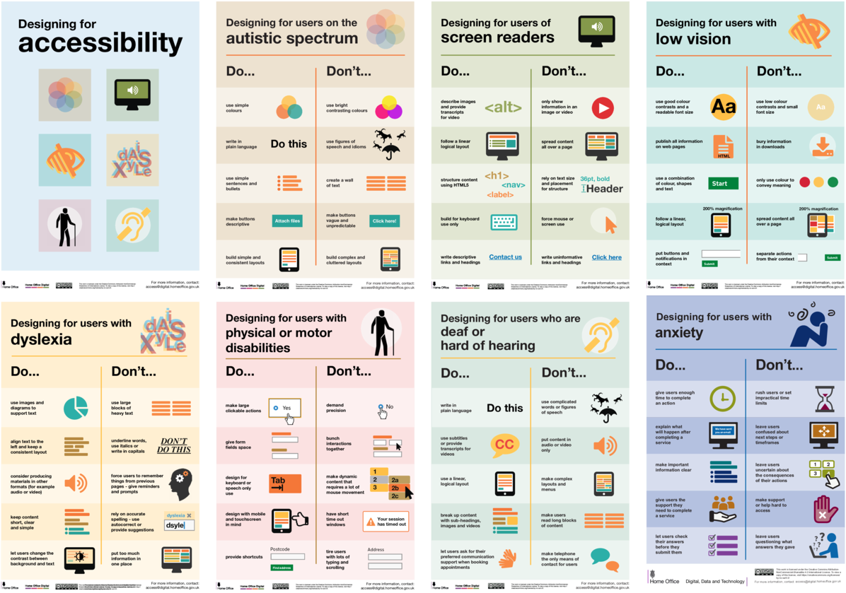
ℹ️ You can download all the posters in the one PDF.
There are other language versions available on the Dos and Don’ts posters GitHub page.
Maintain a meaningful reading order
Webpages have three logical orders that should be kept aligned and consistent:
- Source or markup order
- Visual display order (across all responsive breakpoints)
- Tab or keyboard focus order
To maintain a meaningful flow developers should:
- Use semantic markup and structure its source order with respect to the visual design’s logic
- Test that the tab order matches the source order as close as possible
- Avoid altering the tab order from the source order.
Source order can be determined by temporarily disabling CSS.
Color
Color is not to be used as the only visual means of conveying information.
The WCAG 2.2 level AA compliance level requires color luminescence contrast ratios of
3:1for text with a size of 18 points (14 points if bolded) or larger4.5:1for text with a size less than 18 points.
Type
- Line measures (the width of a line) should not extend more than 80 characters
- Line height (leading) within paragraphs should be at least 1.5 (times the font size)
- Paragraph spacing should be at least 1.5 times larger than the line height.
Accessibility tests
Last modified:
Test software with actual humans, and supplement with automated testing.
Our features are more accessible because the web development and accessibility communities share information and best practices. If you do any testing please share your results.
Automated testing
We use pa11y to help test for accessibility within the build pipeline.
In local development you can also run this yourself:
First build and preview the DS website locally
npm run astro:build
npm -w @bugcrowd/site-astro run preview
Then test accessibility locally
npm -w @bugcrowd/site-astro run test:a11y:localExcluded tests
Due to technical limitations we have disabled WCAG2 color contrast ratio (G18 and G45) and element with a align attribute (H49.AlignAttr and AAA.G141) compliance testing in pa11y.
If you need to track color contrast compliance see the bc-color-a11y() function. The Design system’s color setup uses this function to ensure accessible contrast ratios between fore- and background colors.
References
Last modified:
- W3C’s WCAG 2 at a Glance
- W3C’s WCAG 2.2 specification
- ADA.gov: ADA Standards for Accessible Design compliance
- Google’s web.dev: Introduction to ARIA
- The A11Y Project
- AND.org.au: Making accessibility a core principle — lists many further resources